LEE Filters – Brand identity
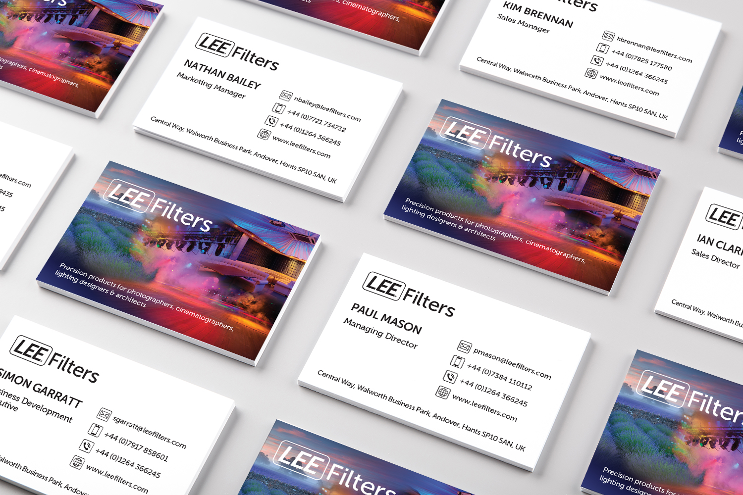
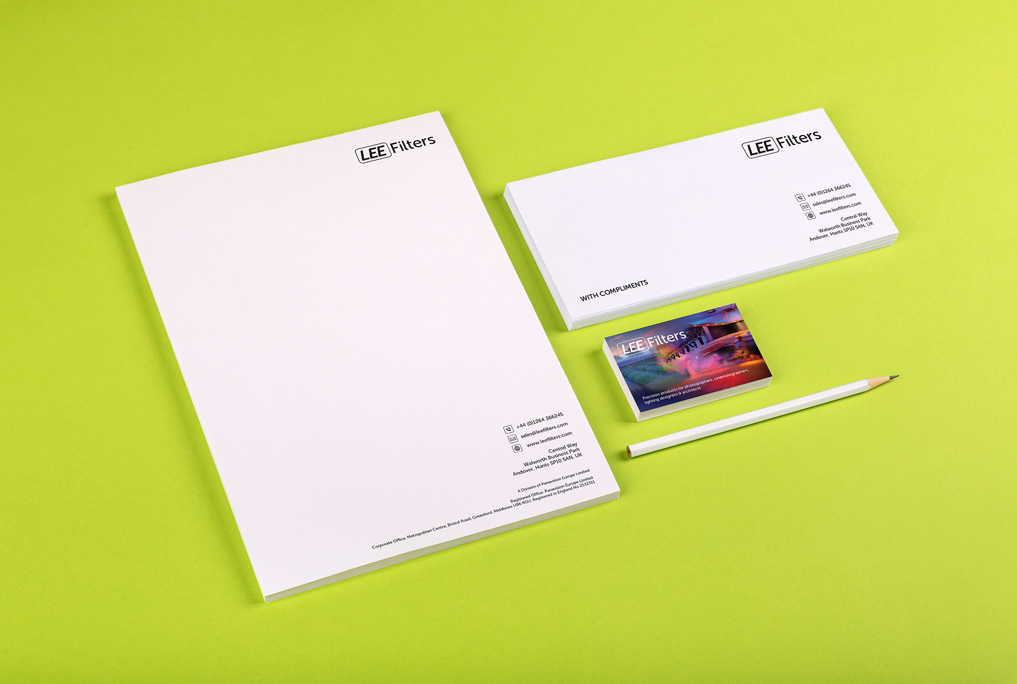
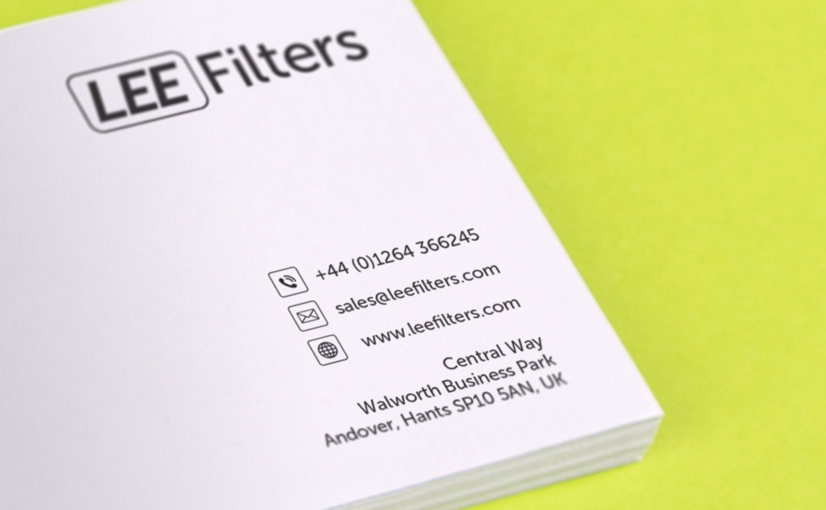
LEE Filters required a refresh of their branding. They were using two separate logos for various divisions of the company, resulting in a confusing message for their customers. The solution is a simple text lead logo, using a rectangle with rounded corners around the word LEE. I had already implemented this graphic style on some logos designed for the branding of new products they had recently launched. They now have a cohesive brand identity that is both modern and fresh looking.
Project
Brand identity
Client
LEE Filters